Grids

Skills Applied

Design | Research | UXUAT | Dev Alignment

Softwares Used

Figma | Sketch | Adobe XD | Invision | FigJam | Abstract

User/Consumer Base

B2B | E-Commerce | B2C

Industry Experience

Fashion | Retail | Financial | Travel | Insurance

Grid-dy Up

Setting up a grid system as a UX designer is crucial when building a design system because it ensures consistency, scalability, and efficiency across digital products. Here’s why it matters:

1. Consistency & Alignment – A well-defined grid provides structure, making sure that elements are properly spaced, aligned, and visually balanced across different screens and devices.

2. Scalability & Responsiveness – A grid system helps designs adapt seamlessly to different screen sizes, ensuring a smooth experience from mobile to desktop.

3. Efficiency & Collaboration – Using a grid system standardizes layouts, making it easier for designers and developers to work together efficiently without constant adjustments.

4. Accessibility & Readability – Proper spacing and alignment improve visual hierarchy and readability, making interfaces more user-friendly.

5. Faster Iteration & Reusability – A structured grid system speeds up design iterations and enables reusable components, saving time and effort in future projects.

By implementing a flexible yet structured grid, UX designers create cohesive, adaptable, and user-friendly interfacesthat enhance the overall user experience.


“A visual made up of columns, gutters, and margins that provide a structure for the layout of elements on a page.”

-NNG

12 Column Grid & Breakpoints

This is a widely used layout system in web design, particularly in responsive frameworks like Bootstrap and CSS Grid.

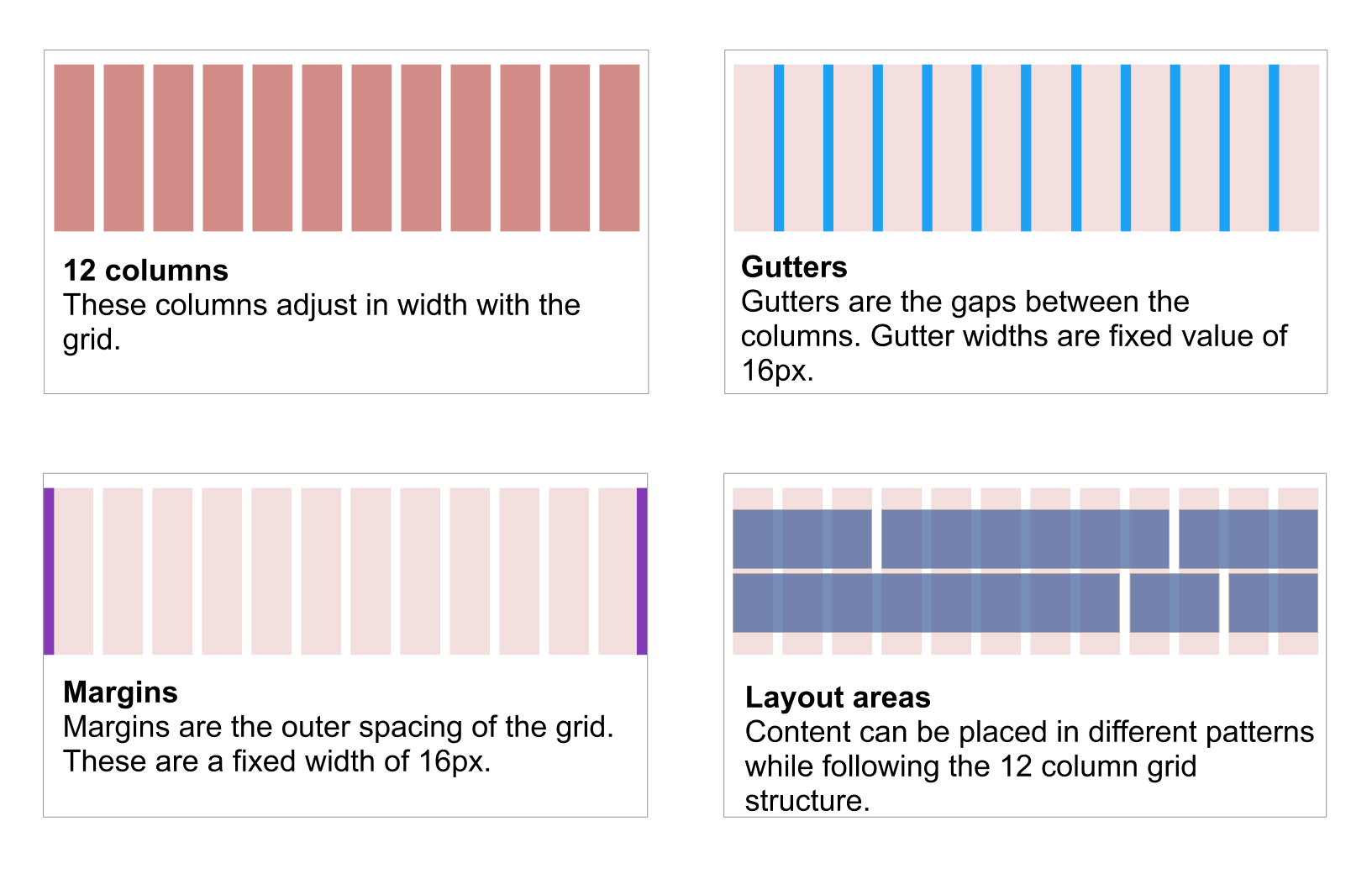
The Fluid Grid System is based off of 12 columns. This consists of margins, gutters and reccomended Layout regions. The overall measurements are dictated by a 4px grid that is incorporated in organizing all the content within the page. This is a core tool in responsive web design, offering structure and flexibility. However, without breakpoints, a grid alone cannot adapt effectively across devices, leading to poor usability.

How Breakpoints Fit Into a 12-Column Grid

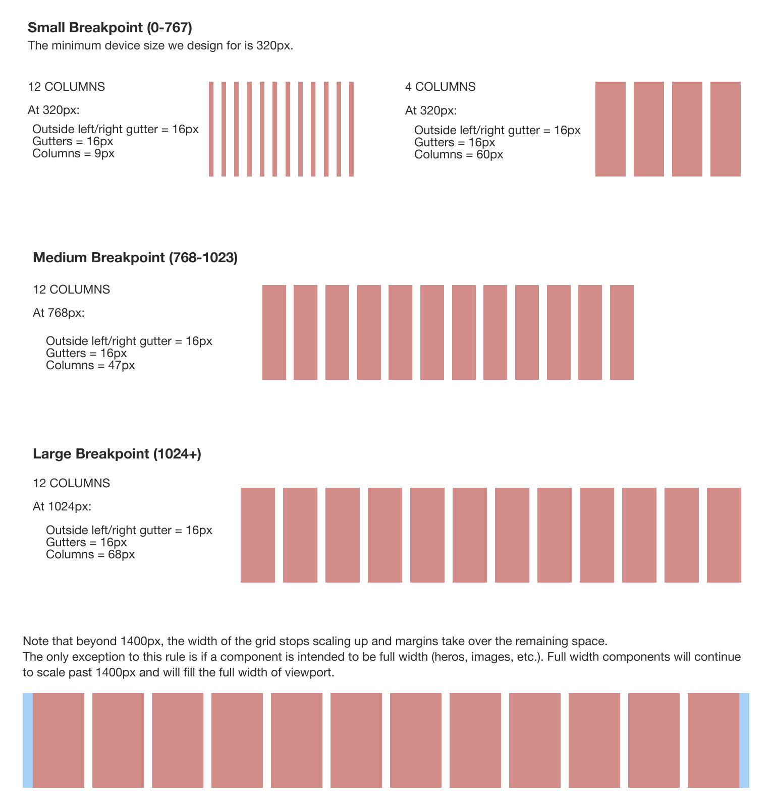
Breakpoints define when layouts should adjust based on screen size. A desktop layout might distribute content across multiple columns, while a mobile layout stacks elements into a single column for better readability. Without breakpoints, designs risk becoming cluttered, unreadable, or difficult to navigate.

By incorporating breakpoints, we ensure:

• Content remains readable and accessible at any size.

• Interactive elements stay touch-friendly on mobile.

• Users avoid frustration from horizontal scrolling or tiny text.

• The layout supports scalability without breaking as screens vary.

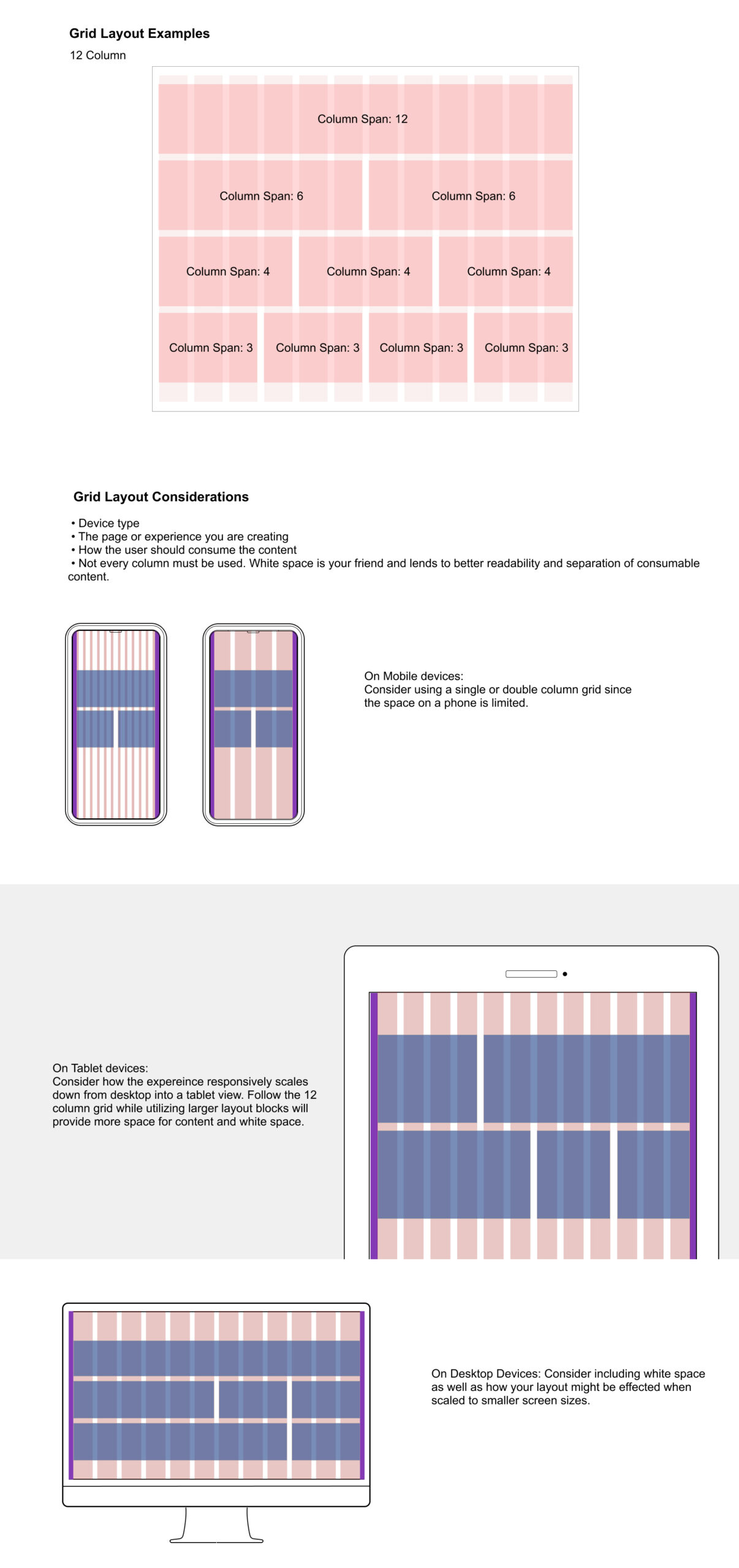
On mobile screens, a 12-column grid typically collapses into a single column to maximize readability. Tablets might display content in two to four columns, while desktops utilize the full 12-column grid to create more complex layouts. For larger screens, designs may scale proportionally without overwhelming the user.

Why Breakpoints Are Essential for UX

Improves usability by adjusting layouts for different screen sizes.

Enhances readability by ensuring text, images, and buttons remain clear.

Optimizes performance by reducing unnecessary elements on smaller screens.

Future-proofs designs, making them adaptable to new devices.

A 12-column grid provides structure, but breakpoints make it functional. UX designers must design responsively, ensuring seamless transitions across devices while maintaining clarity, accessibility, and usability.

Layout Considerations in a 12-Column Grid

Layout regions can span multiple columns and are separated by grid gutters, which provide spacing and organization. When designing within a 12-column grid, several factors influence an effective layout:

🔹 Device & Screen Size – Layouts should adapt seamlessly across mobile, tablet, and desktop, ensuring content remains accessible and easy to navigate.

🔹 Page Content Type – The structure should reflect the nature of the content—text-heavy pages benefit from wider columns for readability, while image-driven layouts may require more visual balance.

🔹 Readability & Hierarchy – Proper column widths help define clear reading paths, ensuring text isn’t too wide (which reduces readability) or too narrow (which can feel cramped).

🔹 White Space & Balance – Effective use of gutters and margins prevents overcrowding, creating a clean and visually appealing design that guides users through content naturally.

Each of these elements works together to create a structured yet flexible layout, ensuring both functionality and aesthetic appeal across different devices and use cases.

Spacing

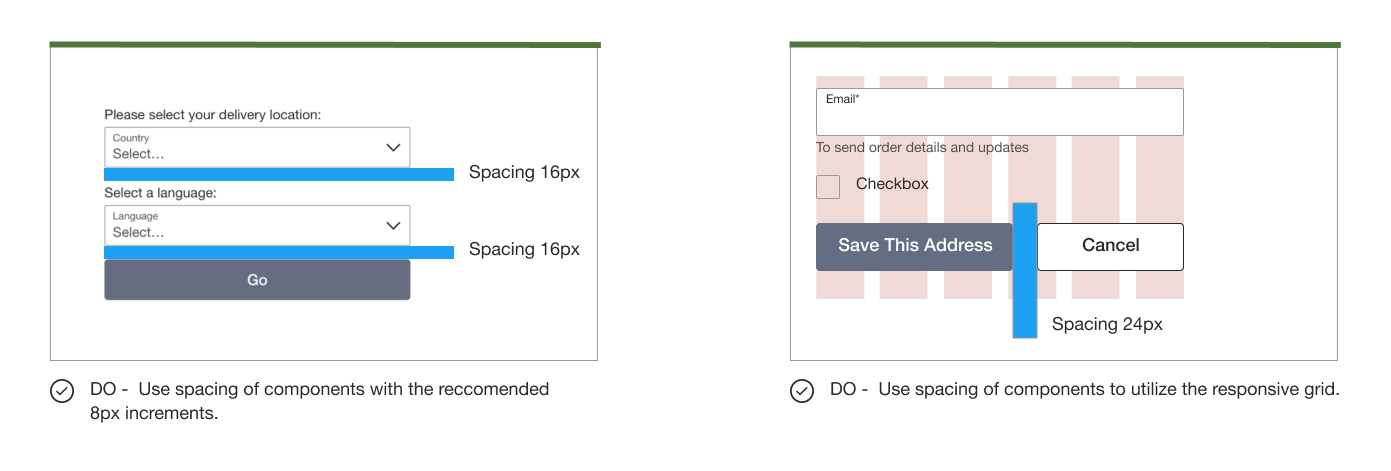
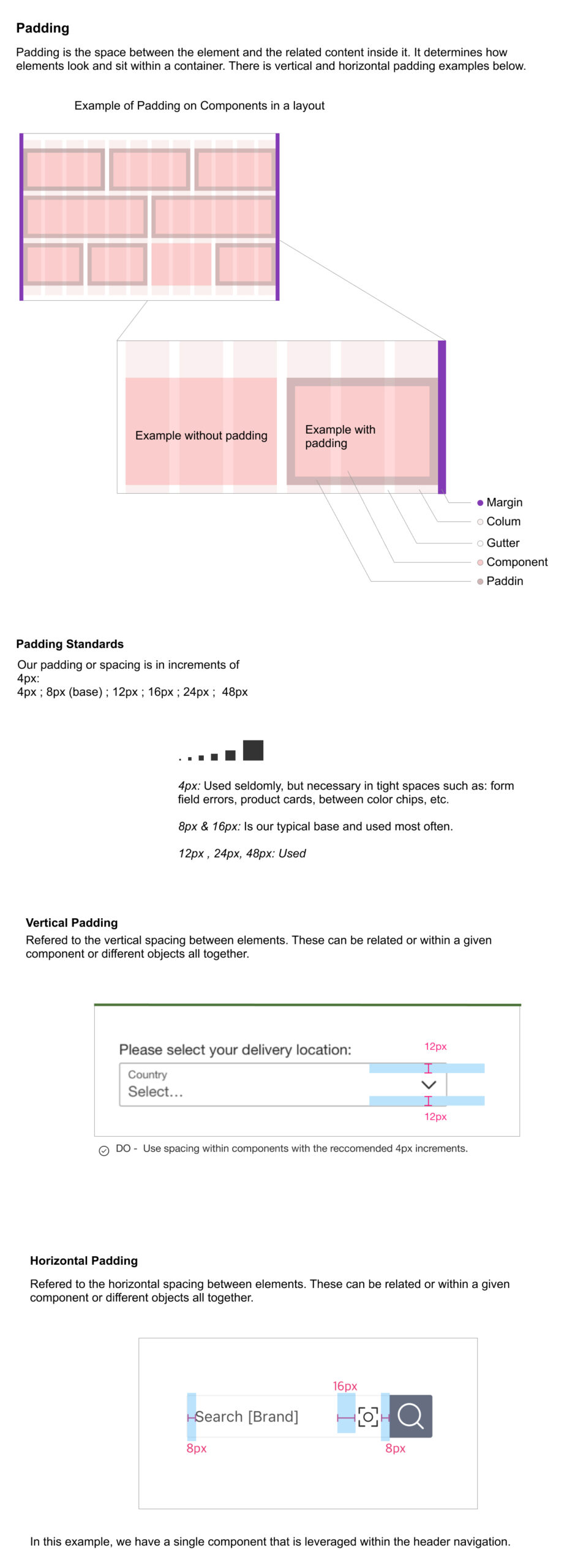
Spacing should be used to define the space between components. It is useful for individual elements that don’t need to adapt responsively to various viewport sizes. Responsive grids should still be used to design overall layouts.