What are Icons?
Icons are visual elements used to help provide clarity to an action, Idea, or function. The icons used in the Canvas Design System should be minimal, clear and effective.
Design | Research | UXUAT | Dev Alignment
Figma | Sketch | Adobe XD | Invision | FigJam | Abstract
B2B | E-Commerce | B2C
Fashion | Retail | Financial | Travel | Insurance
Icons are visual elements used to help provide clarity to an action, Idea, or function. The icons used in the Canvas Design System should be minimal, clear and effective.
The size, color, weight and placement of icons is incredibly important to keep consistency and clarity within a design. Ineffective implementation of any of these factors could lead to issues with accessability and overall usability.
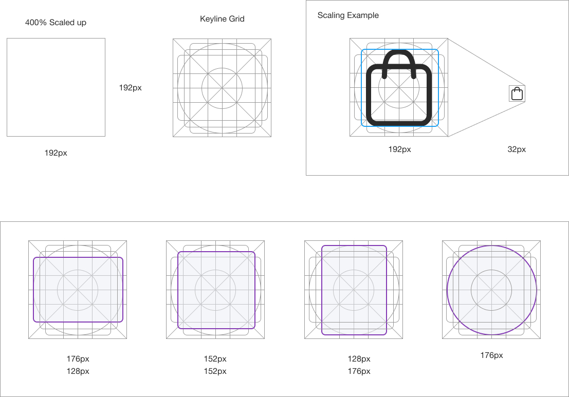
Each Icon will be shown within a bounding box area. This will create a consistent square to control the variation in each icons size. The Overall sizing will be measured from the bounding box edges, not the icon itself.


A keyline grid is used to determine the size and padding for each icon within its bounding box.
When determining the icon padding view and edit it at 400% (192 x 192 dp), which will display edges at 4dp. By maintaining this ratio, any changes to the original will be scaled up or down proportionally, which preserves sharp edges and correct alignment when the scale is returned to 100% (48dp)
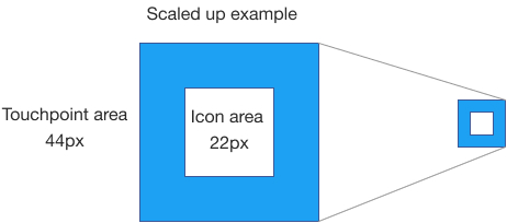
Touch Targets are a margin around the Icon itself that provide an actionable area. The example below shows the 44px touch target for a 22px icon.


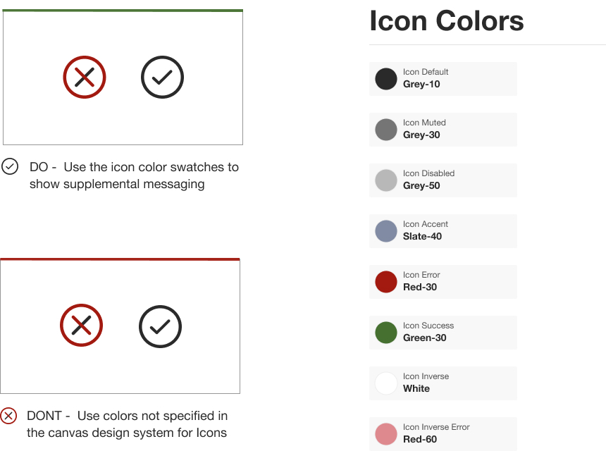
Icons should be colored consistenty and adhering to accessibility guidelines. Icons should be colored with the corresponding icon state as listed below. Keeping color consistency will convey a clear message as to the user what that icon represents.
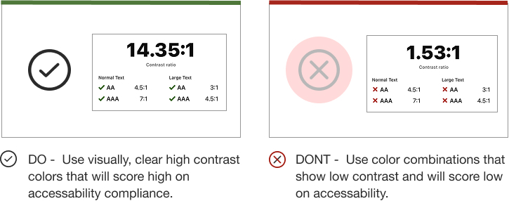
When considering icon use and accessibility, clearly visible icons with contrast from the background color score well. Icons should be shown over white, black, and acceptable selections within the color pallete.

![]()
![]()
![]()