Typography Library

Skills Applied

Design | Research | UXUAT | Dev Alignment

Softwares Used

Figma | Sketch | Adobe XD | Invision | FigJam | Abstract

User/Consumer Base

B2B | E-Commerce | B2C

Industry Experience

Fashion | Retail | Financial | Travel | Insurance

What is Typography?

Typography is a crucial component of user interface that brings consistency and creates hierarchies across platforms. A good type library allows for adaptability across sizes, states and branding.


Typography is a key component in almost every digital experience. However, its complexity and jargon make it a common source of misunderstanding.

Understanding key typography terms will allow you to:

  • Increase the legibility (and therefore usability) of an interface
  • Improve visual polish and professional appearance
  • Create a more consistent brand identity
  • Cut down on costly revisions and iterations
  • Communicate effectively with team members

– Nielson Norman Group

My background as an Art Director has significantly shaped the way I approach typography within design systems from a UX perspective. Having worked on brand manuals for various lines of business at AAA, including RMRS, I gained firsthand experience in creating typography guidelines that balance aesthetics with real-world functionality. For RMRS, I developed standards ensuring that tow truck decals remained highly readable, using a font that was accessible for both print and digital applications. This experience reinforced the importance of selecting typefaces that maintain clarity in varying conditions—whether on a moving vehicle, under different lighting conditions, or on digital interfaces.

Similarly, during my time as an Art Director at Nova Healthcare, I built brand guides that established a consistent and accessible typographic system for healthcare communications. In this context, typography wasn’t just about visual identity; it played a critical role in ensuring patients and providers could quickly and easily understand information. This meant choosing typefaces with optimal legibility, establishing clear hierarchy rules, and maintaining consistency across multiple touchpoints, from print materials to digital portals.

These experiences directly influence my work on typography within UX design systems. I approach type not just as a design element, but as a functional tool that enhances usability, accessibility, and brand coherence. I consider how typography scales across different devices, how it interacts with UI elements, and how it supports readability under various conditions. My background in brand and print design has given me an acute awareness of contrast, spacing, and structure—principles that are just as critical in digital interfaces as they are in physical signage.

By combining my expertise in art direction with a UX-centered approach, I ensure that typography within a design system is not only visually aligned with brand identity but also highly usable, accessible, and adaptable across platforms.

Accessibility

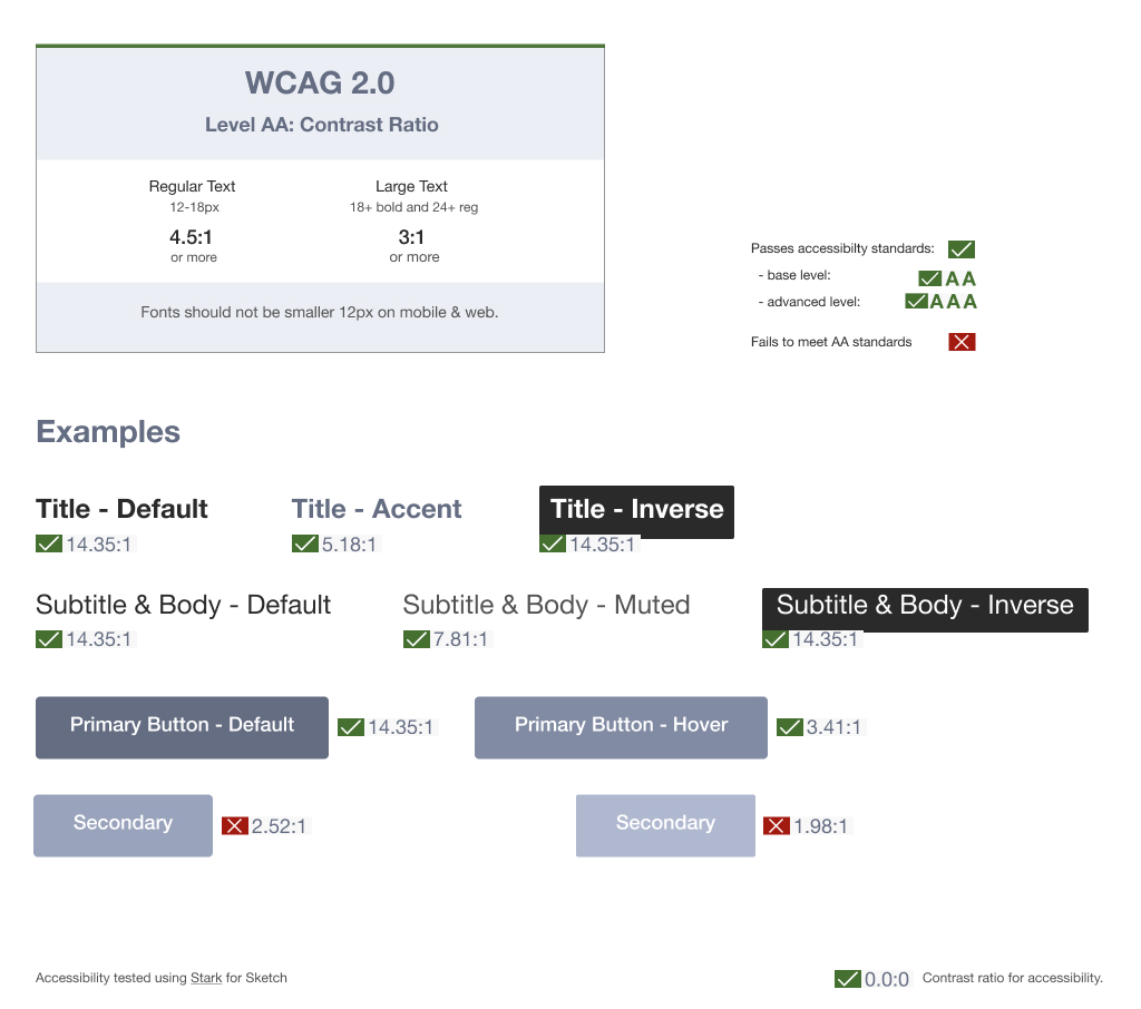
For this brand agnostic library I followed the mid-range AA standard, in order to meet accessibility needs of different groups and situations. This centralized design system was built to be shared across regions and skinned for several brands by various UX teams.


Adhering to guidelines written based on accessibility principles will, at the same time, improve the experience for all users, including those without accessibility needs.”

-Baymard Institute

Size & Weight

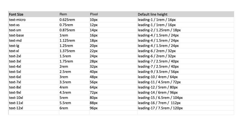
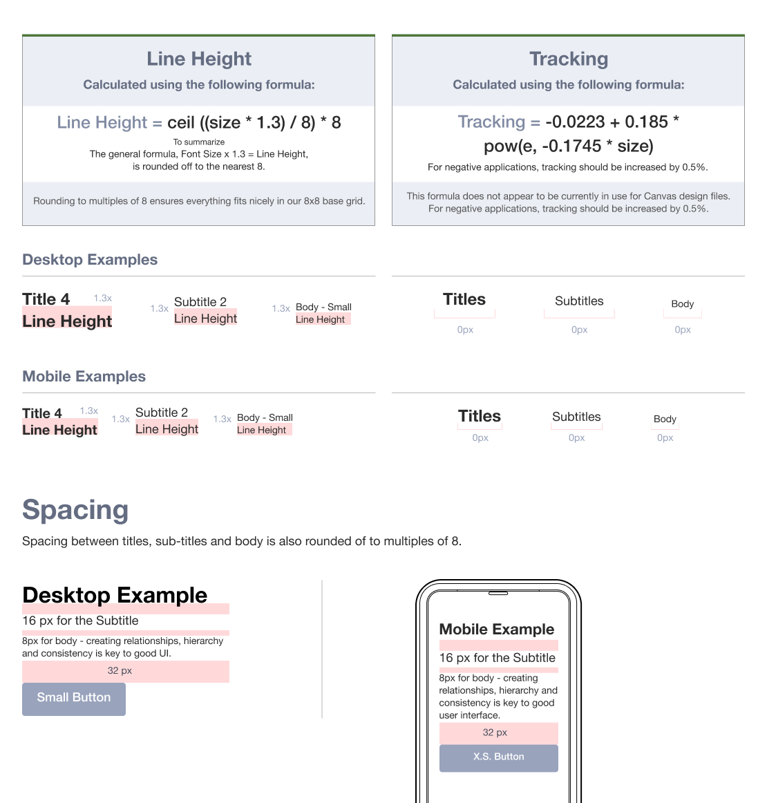
My type scale formula, in this instance, assumes that 1rem=16px. The pixel to rem conversion (with 1.3 multipliers for line height).

The table below shows examples of this conversion along with corresponding line height.

Hierarchy

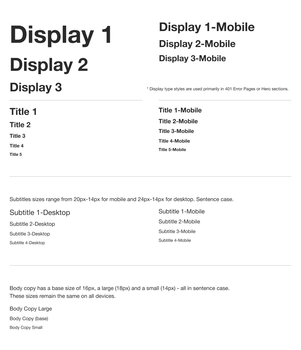
Hierarchy is communicated through differences in font weight, size and case.

These header styles are categorized into Display and Titles. Display sizes are the largest, ranging from 40px-28px for mobile and 80px-40px for desktop – in Title Case.

There are 5 smaller Title sizes, ranging from 22px-14px in mobile and 32px-14px in desktop, also in Title Case.


“A clear visual hierarchy guides the eye to the most important elements on the page.”

– Nielson Norman Group


When building a design system for any eCommerce site, I use text hierarchy to enhance clarity, usability, and navigation. It guides users’ attention, making product names, prices, and calls to action easily scannable, reducing cognitive load and improving decision-making.

I apply hierarchy through font size, weight, spacing, and contrast to ensure consistency across devices. Strong hierarchy also improves accessibility, benefiting all users while driving engagement and conversions. By prioritizing structure in typography, I create a seamless, user-friendly shopping experience.

Line Height & Tracking

Tracking and line height vary with the optical size of text. The mathematical formulas used to calculate each of these are broken down as follows:

Dynamic Text Styling

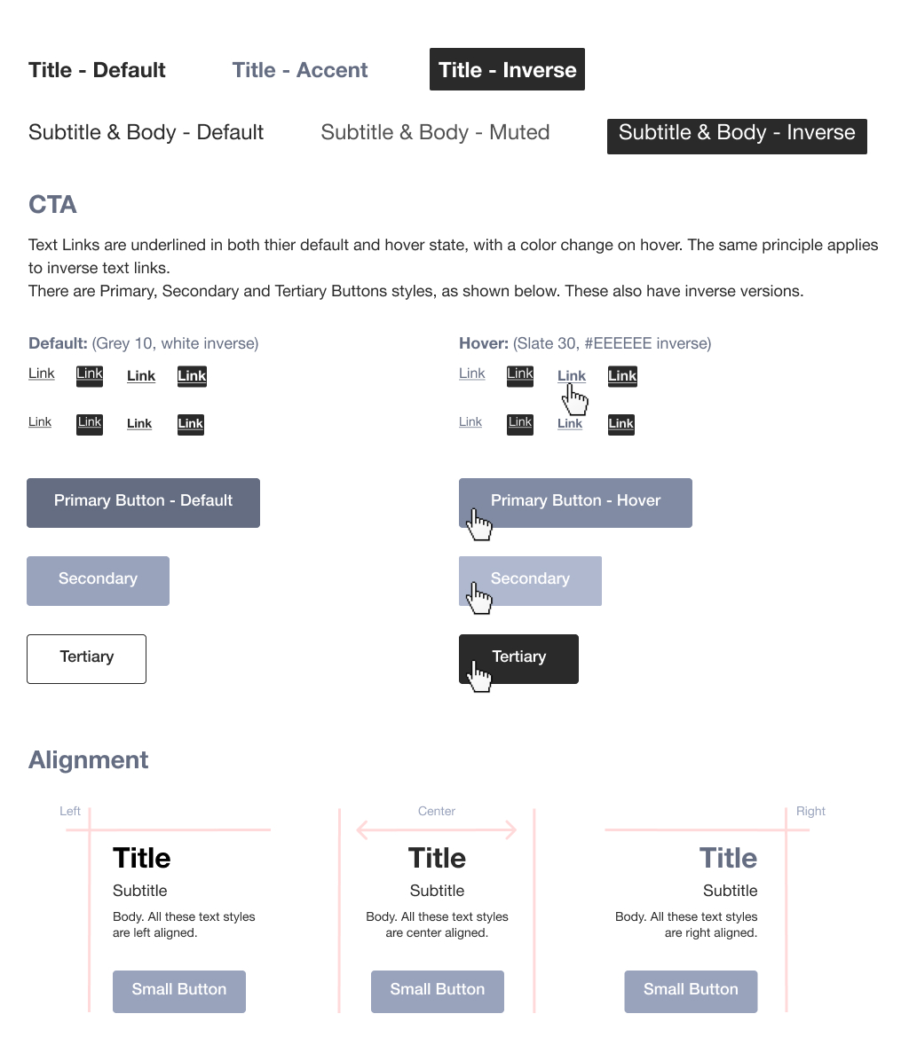
There are three color choices for titles: Grey 10, Slate 30 or White.
Subtitles and body also come in three colors: Grey 10, Grey 20 and White.

Including states, colors, and styles in a type library is essential for creating a cohesive and functional design system. States like default, hover, active, and disabled ensure users receive clear visual feedback, improving usability and accessibility. Consistent link styles help users distinguish interactive elements, reducing confusion and enhancing navigation.

Color choices must align with accessibility standards, ensuring sufficient contrast for readability across all devices and conditions. Defining styles such as bold for emphasis or muted text for secondary information maintains hierarchy and consistency. By documenting these elements in a type library, I create a scalable, predictable system that improves user experience and streamlines design and development.

__________________________________________


Typography is a foundational element of UX design, directly impacting usability, accessibility, and overall user experience. As a UX expert with a background in art direction, I bring a strategic approach to building scalable, user-centered type systems. My prior work on brand manuals as an art director helped reinforce the importance of typography in guiding user perception across digital and physical touchpoints. In eCommerce, I leverage text hierarchy to streamline navigation, improve decision-making, and enhance accessibility. Additionally, I define states, colors, and interaction styles to ensure consistency and intuitive user feedback. By applying UX best practices, I create typography systems that not only align with brand identity but also drive engagement, clarity, and seamless interaction.