SUS | Qualitative & Quantitative | Card Sorting | Tree Testing
Softwares Used
Figma | FigJam | UserTesting.com | Content Square
User/Consumer Base
E-Commerce | B2C
Industry Experience
Fashion | Retail
Executive Summary
I spearheaded a comprehensive overhaul of Vans’ Information Architecture and taxonomy to enhance site navigation and product discoverability. Through rigorous user research and data analysis, I refined category structures and labeling within the mega menu, facilitating more intuitive user interactions. This case study outlines my four-phase test plan, methodologies, challenges encountered, and the resultant impact of these IA enhancements.
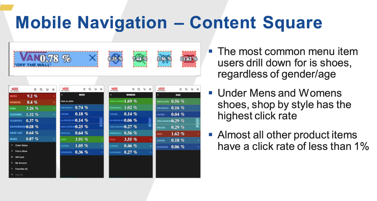
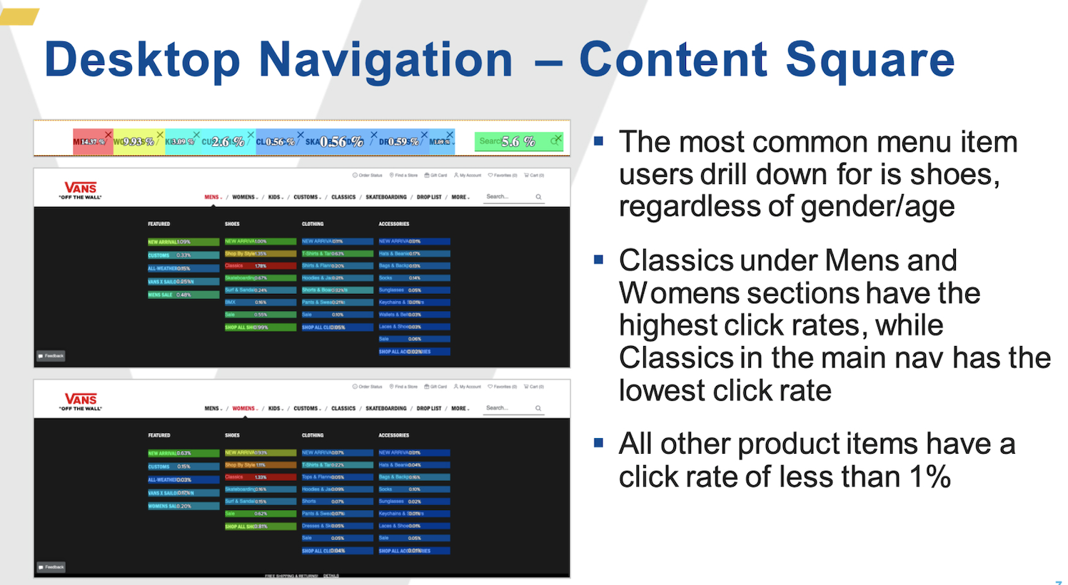
I initiated the project by analyzing performance metrics of Vans’ existing mega menu using Content Square. Upon identifying key pain points, I formulated a hypothesis and developed a preliminary test plan, which I presented to the brand’s stakeholders.
This initiative expanded to involve Vans’ marketing and product catalogue teams, evolving into a comprehensive project. Below is an overview of my four-phase plan to revamp Vans’ taxonomy.
Methodologies
1. System Usability Scale
2. Familiarity Test (Quantitative)
3. Moderated Open & Closed Card Sorting (Qualitative)
4. Tree Testing (Quantitative)
To uncover navigation pain points, I conducted a System Usability Scale (SUS) study, which highlighted issues with category labels, search functionality, and filtering options. Employing both open and closed card sorting techniques, I explored user mental models and validated these insights through tree testing to evaluate the effectiveness of the updated taxonomy.
Collaboration with stakeholders was vital, but due to layoffs, I had to quickly onboard a new set of stakeholders mid-project. I navigated this by using presentation decks and metrics to communicate the initial ask, goals and current project status, highlighting the importance of managing political dynamics in the UX process.
SUS (System Usability Scale)
The SUS is a standardized questionnaire used in UX to assess the usability of a product by measuring the ease of use, efficiency, and overall satisfaction experienced by users. It provides a quick, quantifiable way to evaluate user perceptions.
In the context of the Vans IA and taxonomy overhaul, SUS results identified critical pain points in site navigation, content discoverability, and overall usability. Users faced challenges locating products and navigating between categories, indicating inefficiencies in the existing information architecture.
These findings informed the prioritization of structural changes, including reorganizing the taxonomy to establish a more intuitive hierarchy and refining labeling conventions. Addressing the issues highlighted by the SUS scores enabled the design of a streamlined IA that reduced user friction, enhanced overall experience, and aligned the site more closely with user expectations. The SUS insights were pivotal in guiding data-driven decisions throughout the project.
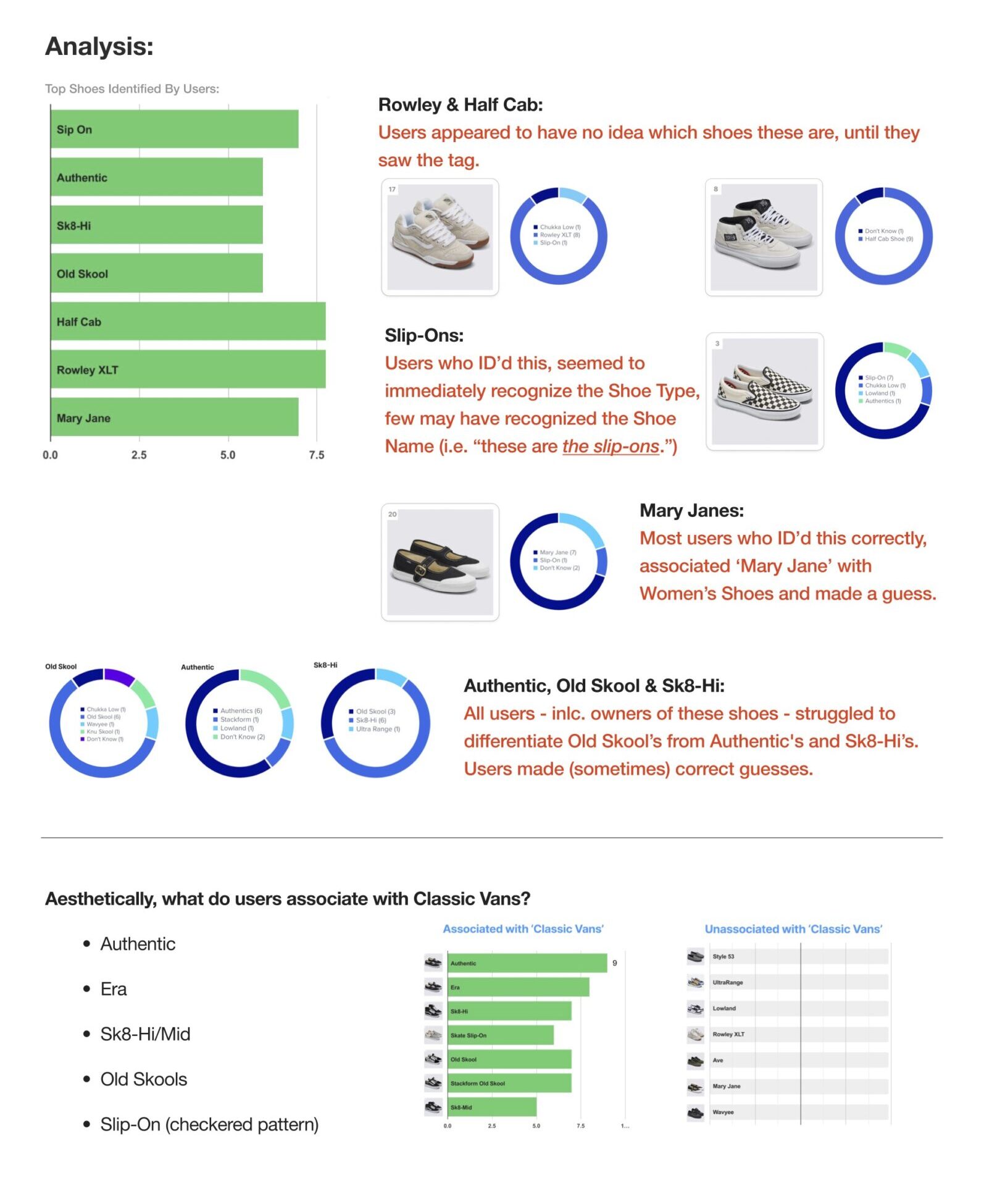
Hypothesis: Users may not be familiar with Vans shoe names to the extent that they can effectively find them through the mega menu.
Goal: Gauge users familiarity & knowledge of Vans shoe styles. How & where on the website can this be made most helpful to users?
Methodology: To address friction points uncovered during the System Usability Scale (SUS) study, I collaborated with stakeholders to review key site metrics. This helped pinpoint product pages with the lowest engagement, as well as Vans’ best-selling styles.
A final selection of 21 shoes was presented to 10 users, who were asked to match shoe names from a list. Users could select multiple answers, allowing me to identify overlapping confusion. Follow-up questions probed the reasoning behind misidentifications and how users perceived each shoe’s intended activity.
Findings & Actionable Insights
Primary Pain Points
Users struggled to associate product names with their respective styles.
Commonly mistaken shoe models indicated gaps in taxonomy clarity.
The existing mega menu organization did not align with user mental models.
Thematic Findings
Exposure: Though participants are familiar with a Standard Vans ‘Look’, this idea varies from user to user.
Context: Most users require some point of reference with Vans Shoe Names, whether it is through imagery or using language that speaks to them
Consumer Education: Bridging the gap in consumer knowledge of Vans’ shoe names will simplify website navigation, improving user engagement with the site.
This insight led to refining category groupings and renaming ambiguous labels, ensuring the taxonomy aligned with user expectations and enhanced product findability.
Conclusion
While consumers may recognize the brand’s classic styles, they often struggle to identify specific names. This suggests a gap in consumer knowledge regarding the brands’ catalogue.
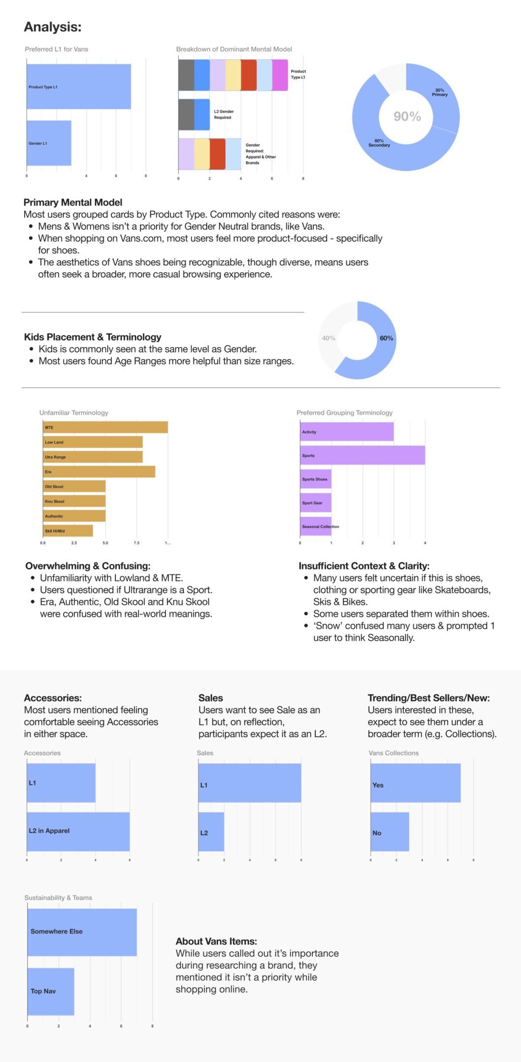
Hypothesis: Users are less familiar with Vans’ existing nav structure and/or some terminology in it.
Goal: Get a holistic view of the average users’ Mental Models to discover new ways we can categorize our products.
Method: I moderated 30 open sort sessions using a self-made Figjam template.
Key Findings
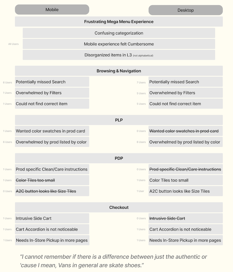
Cognitive Load: Some consistency & consolidation is required in the mega menu. Most users felt overwhelmed not just by the number of menu items but also by unfamiliar terminology°
Unisex Appeal: Vans’ embrace of Unisex Fashion resonates with users, reflecting the brand’s inclusive & versatile styles.
Utilize Website Real Estate: Secondary mental models & user needs can also be met with a more intuitive Filter, PDP, Footer & Utility nav experience.
In/Tension Modeling
I love using In/Tension modeling, a powerful synthesis method that turns conflicting data into insights. Instead of dismissing polarized perspectives, I dive into them—collecting both dominant and secondary mental models from users. By mapping these models with graphs and charts, I visualize the differences and zero in on the overlapping behaviors and pain points that reveal unexpected connections.
During this card sort, I noticed something fascinating. Users were conflicted about how they shop by gender, and as I rewatched the sessions, I saw many actually revise their initial card organization. It was almost as if they were battling a deeply ingrained urge to shop by gender—a structure they’ve grown used to. It was an exciting moment, witnessing that shift in mental models and realizing how fluid user thinking can be when prompted to reimagine their choices.
During these moderated sessions, I probed into why users revised their card sorting and found that their perception of the Vans brand played a major role. Vans, associated with the gender-neutral look of skate and BMX culture, led users to shift from traditional, gender-based shopping habits. Initially, many defaulted to sorting by gender, but as they reflected on Vans’ unisex appeal, their mental models changed. This revealed how strongly brand identity can influence and reshape consumer behaviors, even overriding ingrained shopping patterns once users recognized the brand’s inclusive philosophy. (Read more here)
Opportunities for Improvement
Add consistency to terminology and remove repetitive items.
Allow users flexibility to narrow their search results using Filter and PDP selectors (e.g. Gender, Wides, etc.)
Prioritize consumer exposure & education on Vans’ Shoe Names and deprioritize non shopping related information such as Sustainability, which users expected to find in the Footer or PDP. A/B Test.
Tree Testing
After incorporating stakeholder feedback with user insights, I tested fundability of Vans resources in this navigation structure on 100 users.
Results were at near 100%, with room for further exploration before making final recommendations during share-out with brand.
Summary of Validations
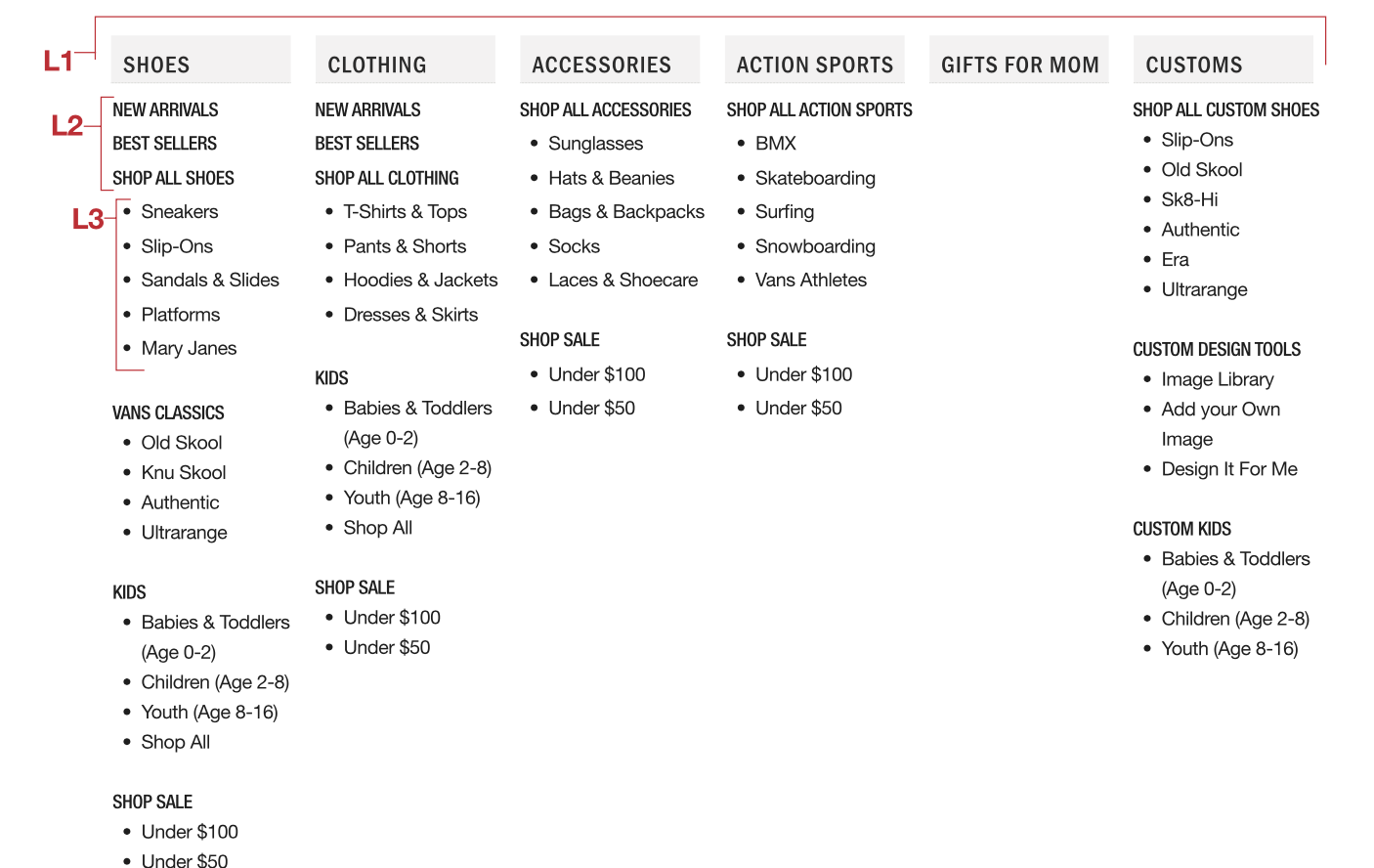
Closed Card Sort
As the next step in my research, I conducted a closed card sort using predefined categories finalized with stakeholders to validate findings from Phases 1 and 2. The results were promising: the genderless model resonated with Vans users, and both Vans and non-Vans users appreciated the improved context and consistency in the mega menu. While sorting was smoother, with fewer discarded cards, users still experienced cognitive overload and highlighted the need for consolidation, providing clear direction for refining the model further.
Tree Testing
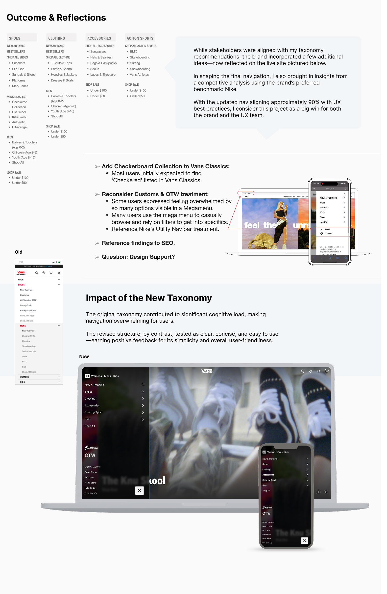
To test the usability of the new taxonomy structure, I conducted a tree test to evaluate user navigation within the information architecture. The findings revealed that users appreciated the simplistic and consistent labeling, which enhanced their navigation experience. However, 48% of users expected to find “Checkered” under Vans Classics, highlighting a menu oversight. Additionally, “Vans Customs” and “Off the Wall” were challenging to locate, as many users were unfamiliar with these categories. This feedback underscores key areas for improvement in the overall menu organization.
Metrics and Outcomes
The results of our overhaul have been remarkable! In just three months post-launch, we saw a 35% increase in user engagement and a 25% reduction in bounce rates, showing users can find what they need more efficiently. User satisfaction ratings also rose by 40% in post-launch surveys, demonstrating the new design’s positive impact. These metrics validate our efforts and motivate us to keep enhancing the user experience. I’m excited about our achievements and eager to apply these insights to future projects!
User Feedback
Pretty easy to browse through…Umm I would say well labelled and well organized!